Thermal Tuning Slideshow
Written by
in


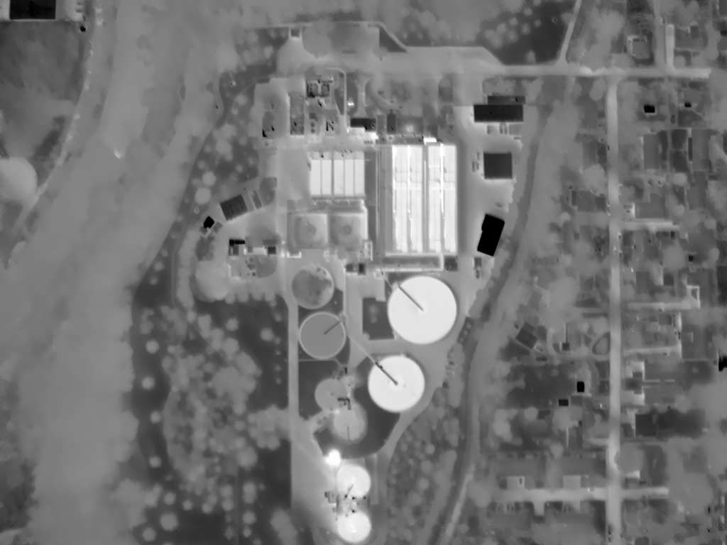
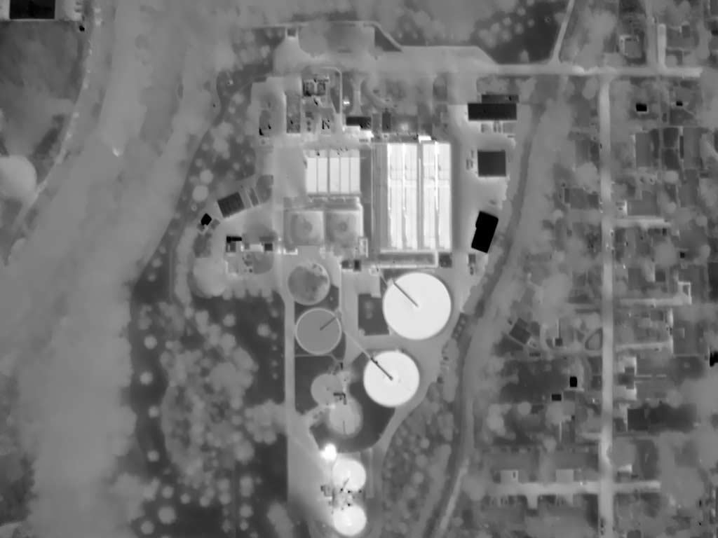
Common tuning using a monochromatic palette; the full range of the palette is applied globally to the image. Such a generalized preparation is sometimes used for orientation with context but typically compromise patterning in specific areas of interest.


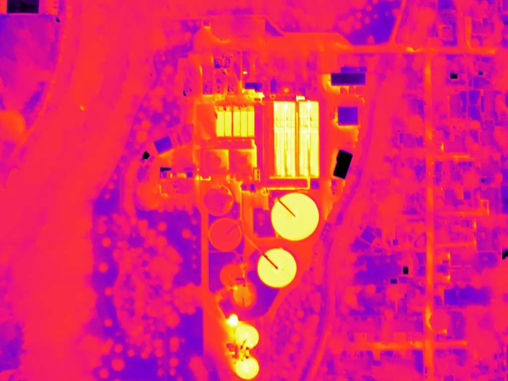
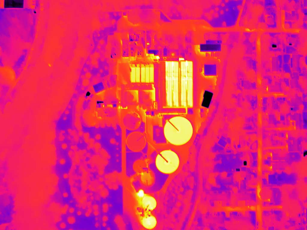
Common tuning using the Ironbow palette. While aesthetically entertaining, such preparations are typically of little real value; low contrast palettes should only be considered for high contrast subjects. The exploitation of color is inappropriate for larger or critical audiences due to common variabilities in human vision.


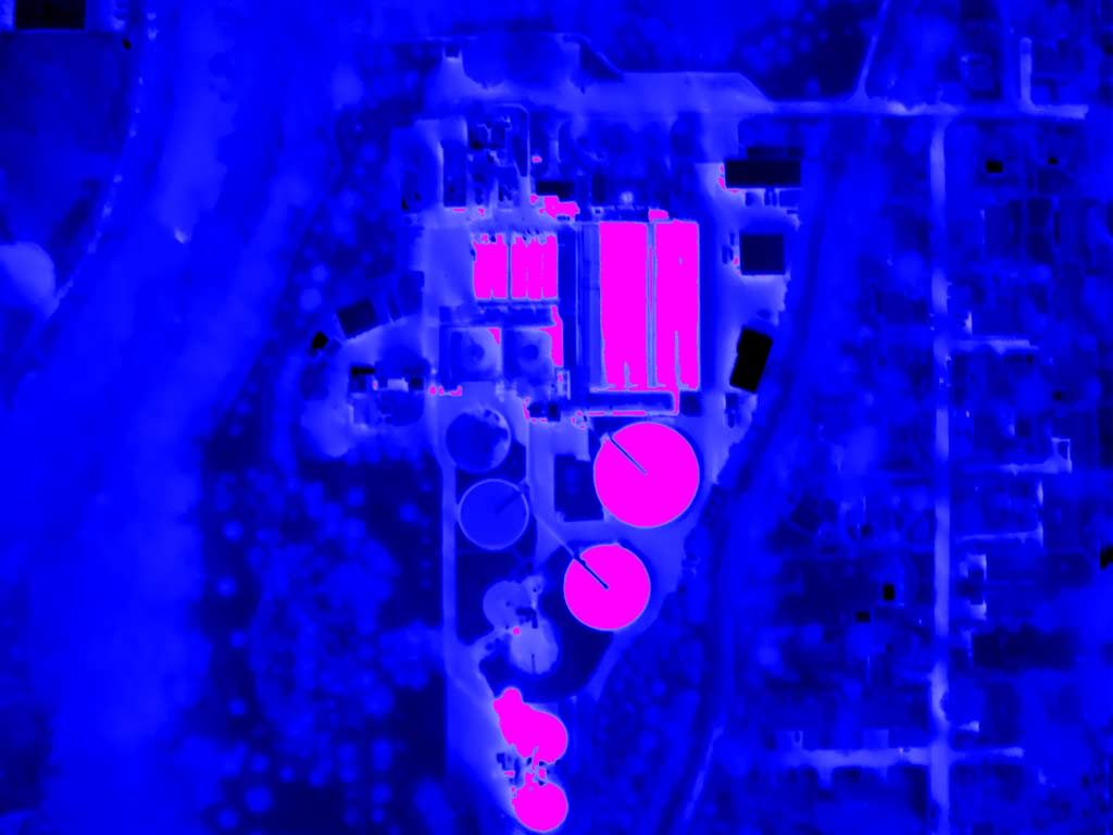
Common tuning using a blue palette and a magenta Isotherm above an apparent temperature of 66°F. The application of the Isotherm masks all details above its base but is useful for coarse qualitative assays.


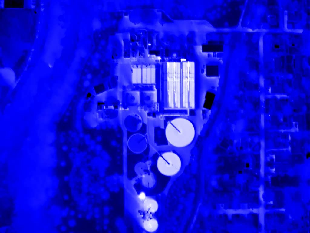
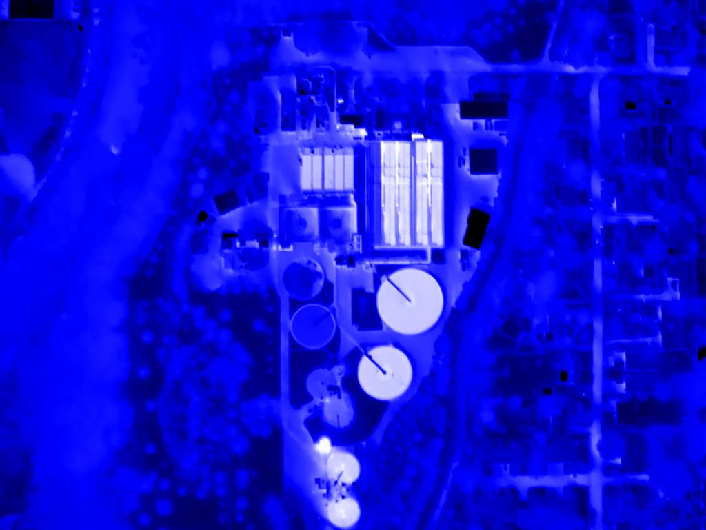
Common tuning using a blue palette with a blue-to-white gradient map above an apparent temperature of 66°F. FLIR’s ResearchIR software accomodates creation of customized gradient maps (palettes) that may be more effective and descriptive than Isotherms.


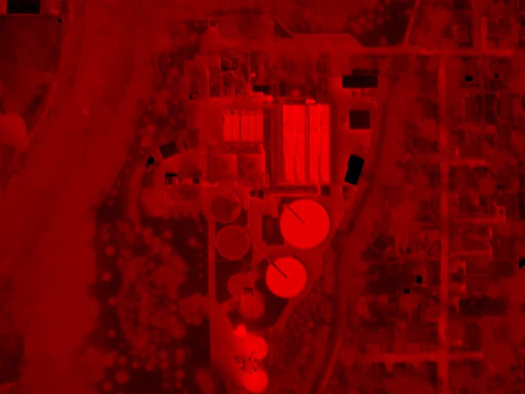
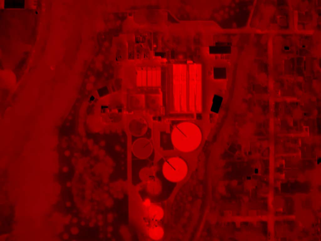
Common tuning using a red palette. Some palettes are intrinsically suggestive and thus unfit for critical assays. Red is coincidentally associated with higher temperatures, and blue with cooler. It is easy to reverse the palettes (including monochromatic palettes) to produce counterintuitive displays. Temperature indicator bars should not be included on apparent temperature/total radiosity thermograms.


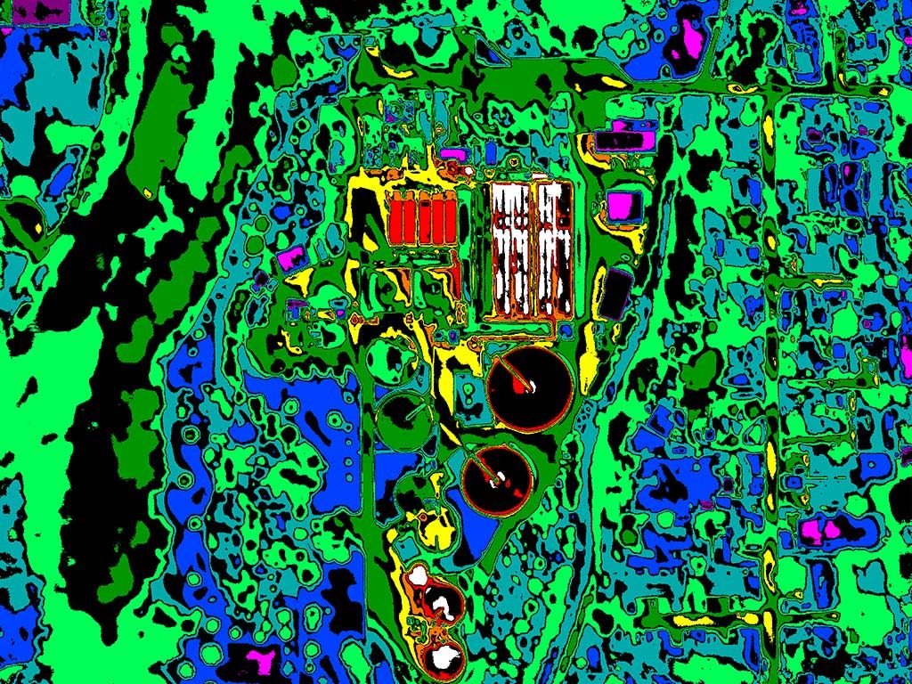
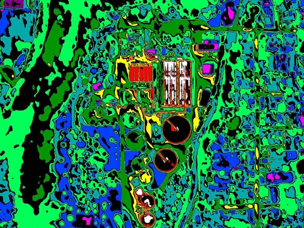
Common tuning using a high contrast palette. High contrast palettes are useful on low contrast or otherwise compromised thermograms, though they are know for a cartoonish presentation. The frontiers of preformulated high contrast palettes are usually not adjustable and thus may amount to somewhat less than Isotherms in critical assays.


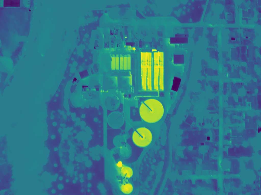
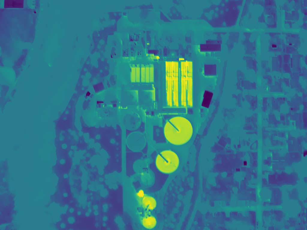
Common tuning using a Viridis (defensibly forensic) palette. Viridis and various derivatives are (theoretically) perceptually uniform and “robust to colorblindness” (meaning achromatopsia and a variety of dyschromatopsias). Global application of a Viridis palette suffers the same ruinations as other palettes, and is not immune to challenges of inflential colorization (hue/chroma/luma, HSB, or HSL).


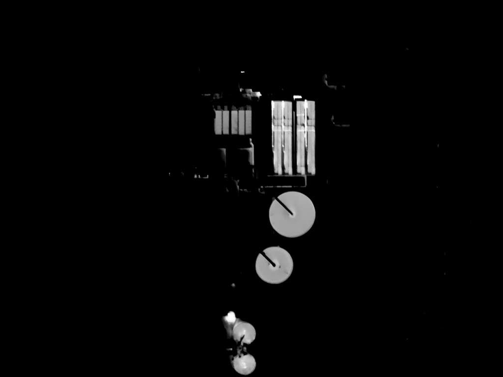
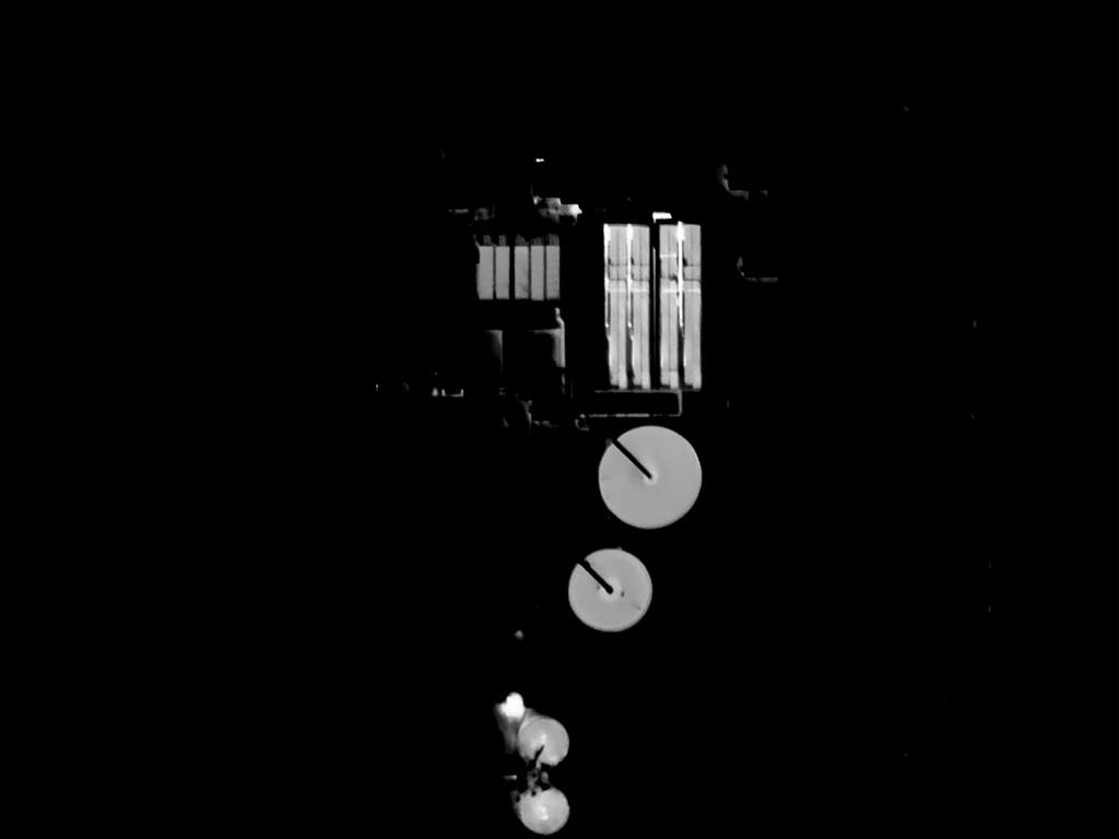
Tuned specifically for the process vessel contents using a monochrome palette. Context is sacrificed for the better representation of apparent thermal patterns in areas of specific interest.


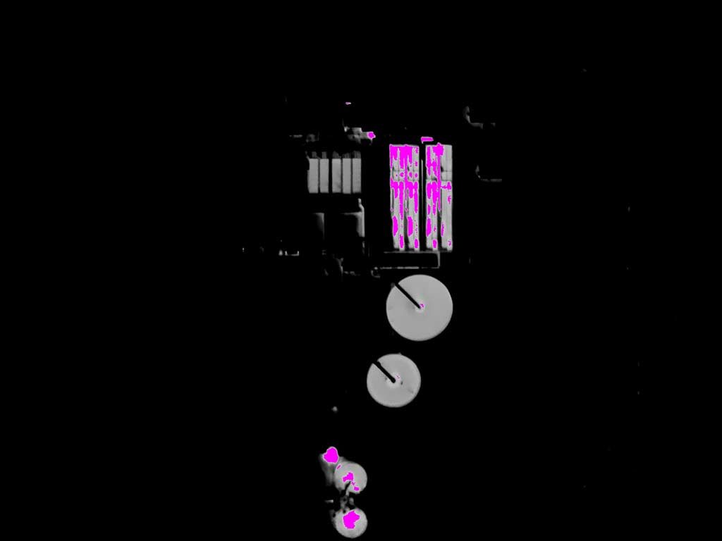
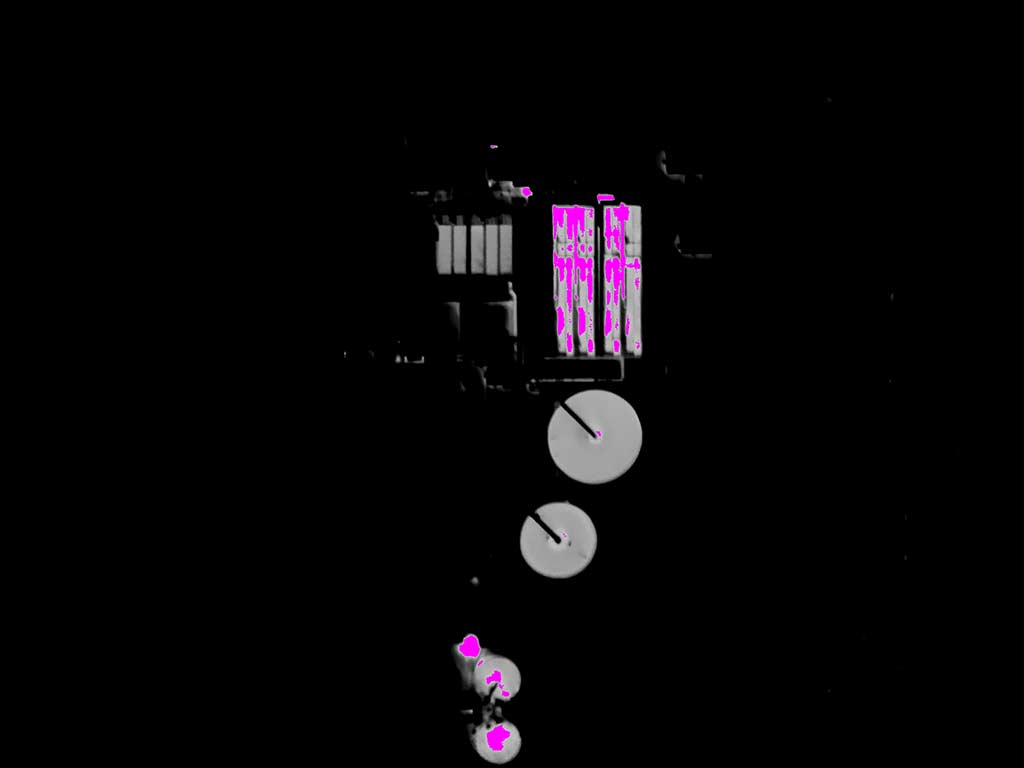
Tuned specifically for the process vessel contents using a monochrome palette and a magenta Isotherm above 70°F…effectively concealing apparent temperature details above 70°F. This does accomodate rapid assimilation but masks potential indications of pathologies in the high key (where one would expect them to be).


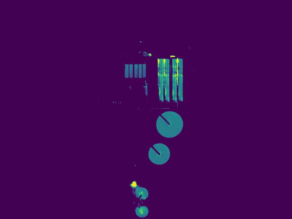
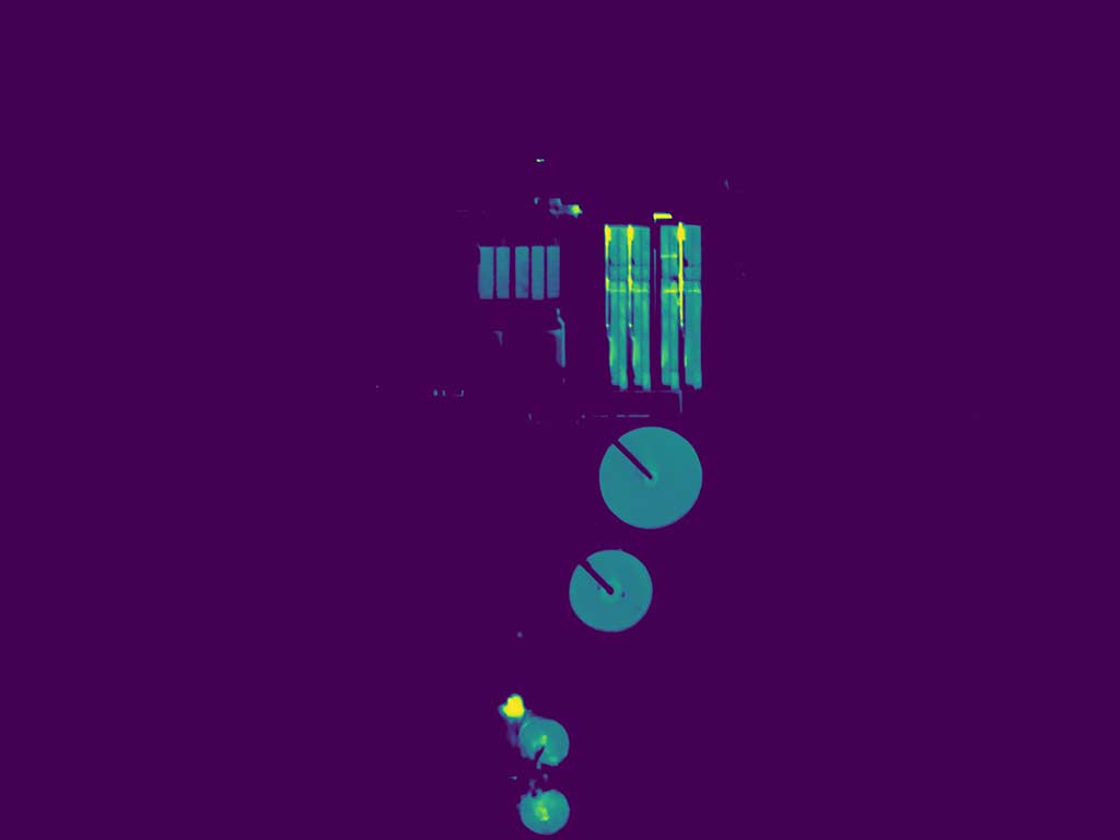
Tuned specifically for the process vessel contents, using a Viridis (forensically defensible) palette. This is the only preparation in this collection that should be considered prima facie forensically fit.